Data Search

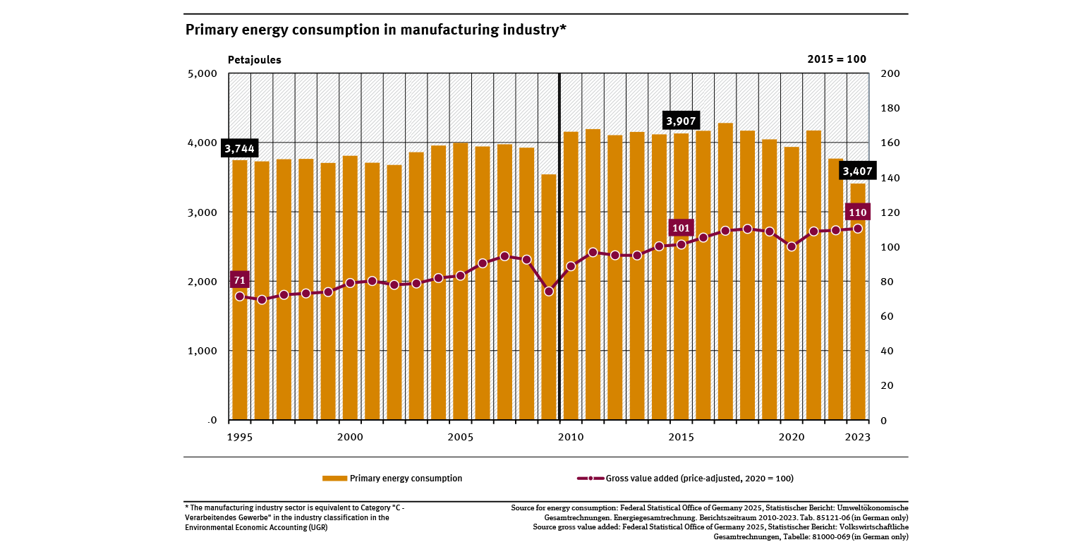
Primary energy consumption in manufacturing industry
- Energie
- Umwelt und Wirtschaft
- Diagramme
- Umwelt-Indikatoren
- Daten und Tabellen

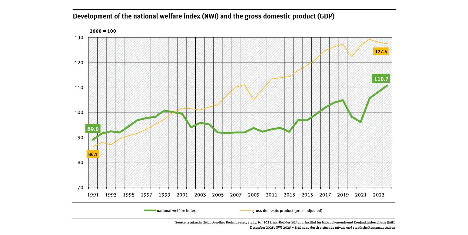
Development of the national welfare index (NWI) and the gross domestic product (GDP)
- Umwelt und Wirtschaft
- Diagramme
- Umwelt-Indikatoren
- Daten und Tabellen

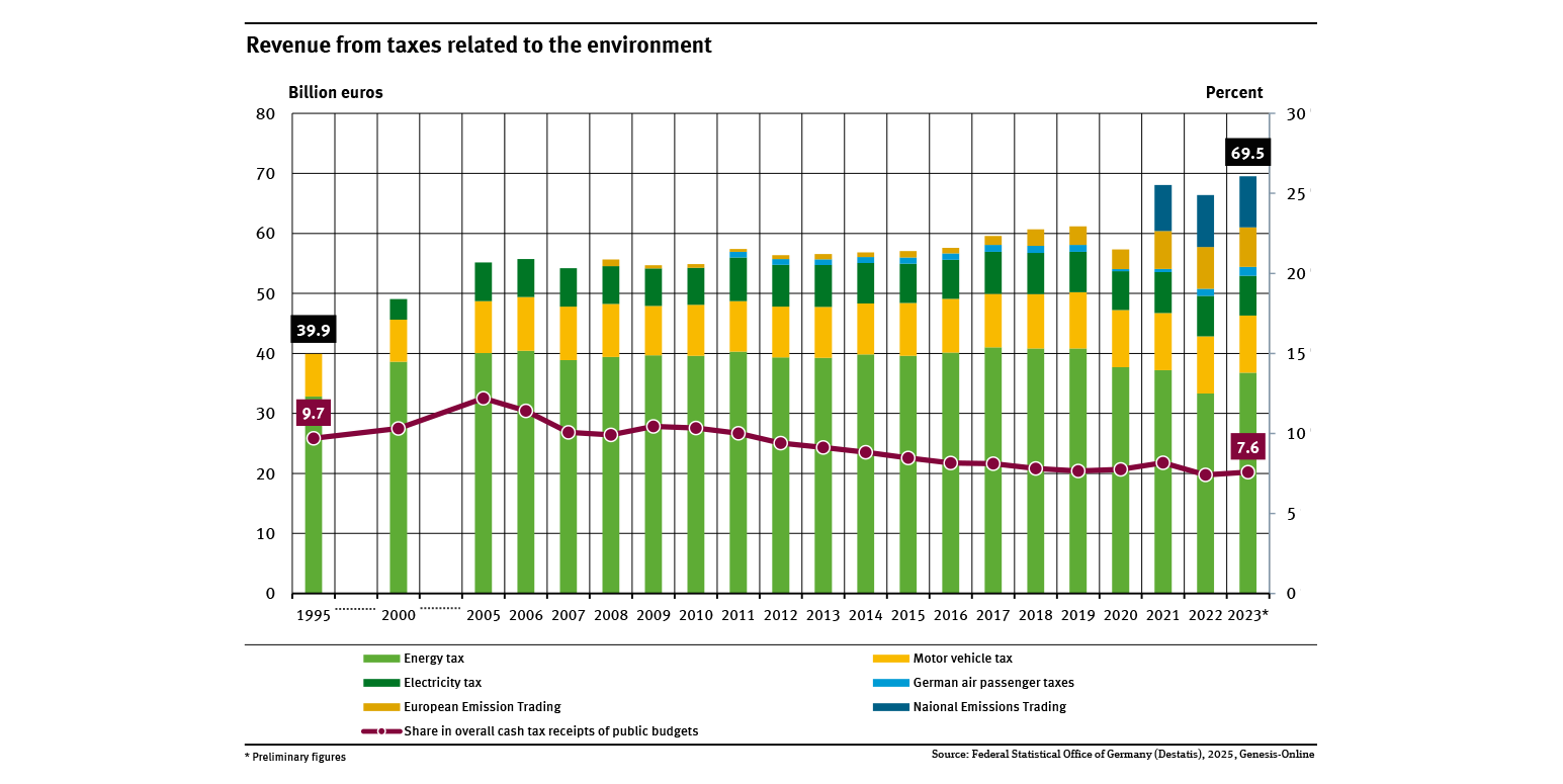
Revenue from taxes to the environment
- Umwelt und Wirtschaft
- Diagramme
- Umwelt-Indikatoren
- Daten und Tabellen

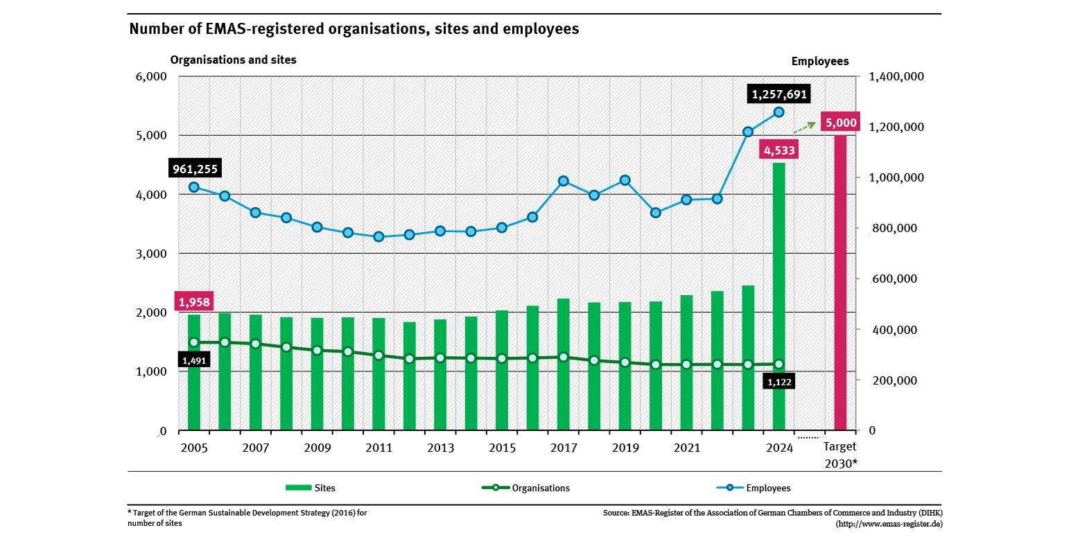
Number of EMAS-registered organisations, sites and employees
- Umwelt und Wirtschaft
- Diagramme
- Umwelt-Indikatoren
- Daten und Tabellen

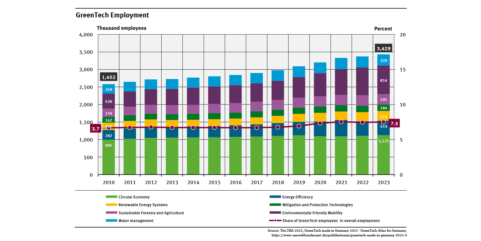
Employment in environmental protection
- Umwelt und Wirtschaft
- Diagramme
- Umwelt-Indikatoren
- Daten und Tabellen

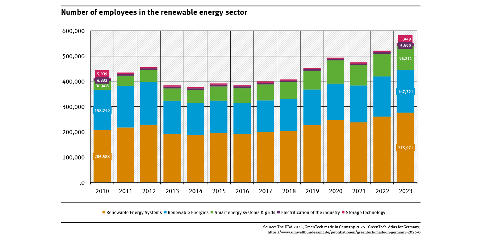
Number of employees in the renewable energy sector
- Umwelt und Wirtschaft
- Diagramme
- Umwelt-Indikatoren
- Daten und Tabellen

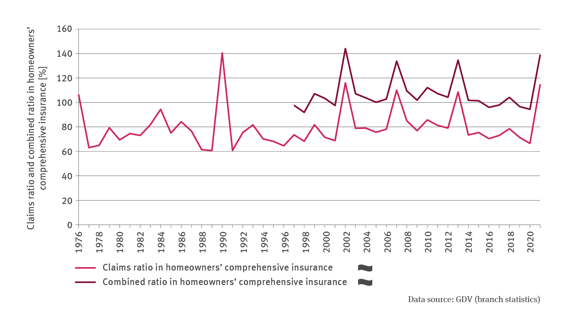
FiW-I-1: Claims ratio and combined ratio in homeowners’ comprehensive insurance
- Klima
- Umwelt und Wirtschaft
- Diagramme
Export data

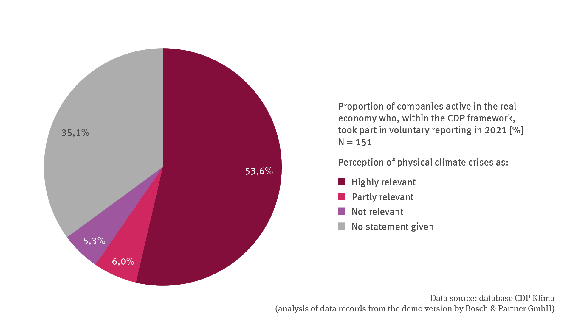
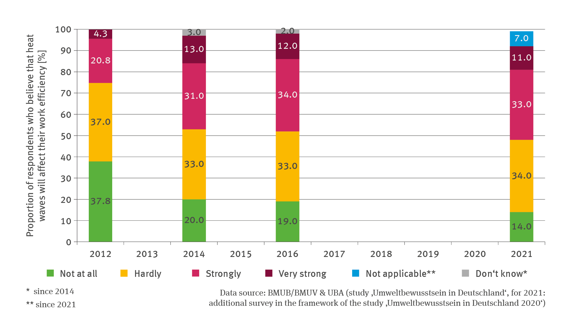
IG-R-1: Perception of the relevance of physical climate risks in trade and industry
- Klima
- Umwelt und Wirtschaft
- Diagramme
Export data


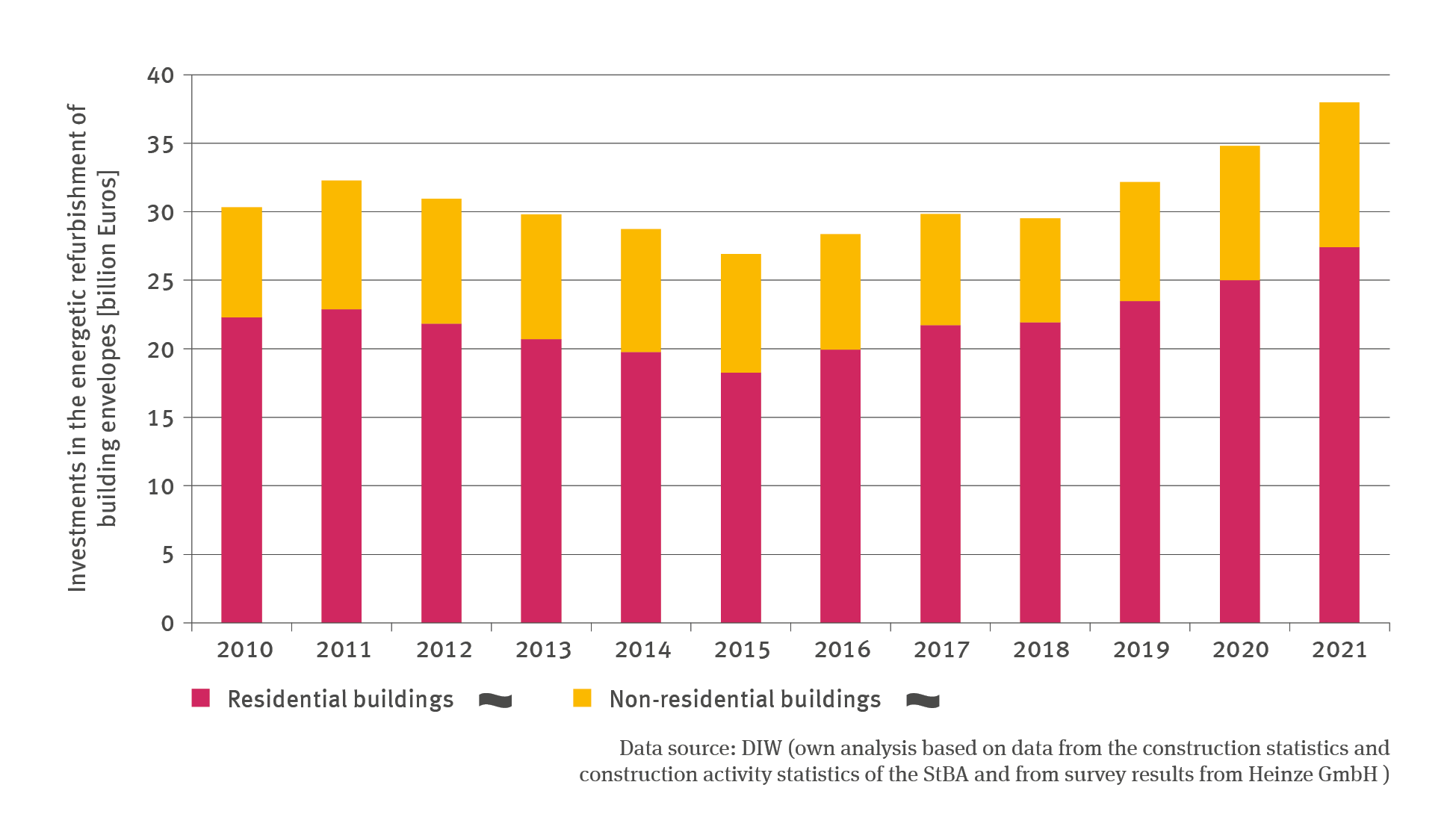
BAU-R-3: Investments in the energetic refurbishment of building envelopes
- Klima
- Energie
- Umwelt und Wirtschaft
- Diagramme
Export data