Skip to main content Skip to main menu Skip to footer

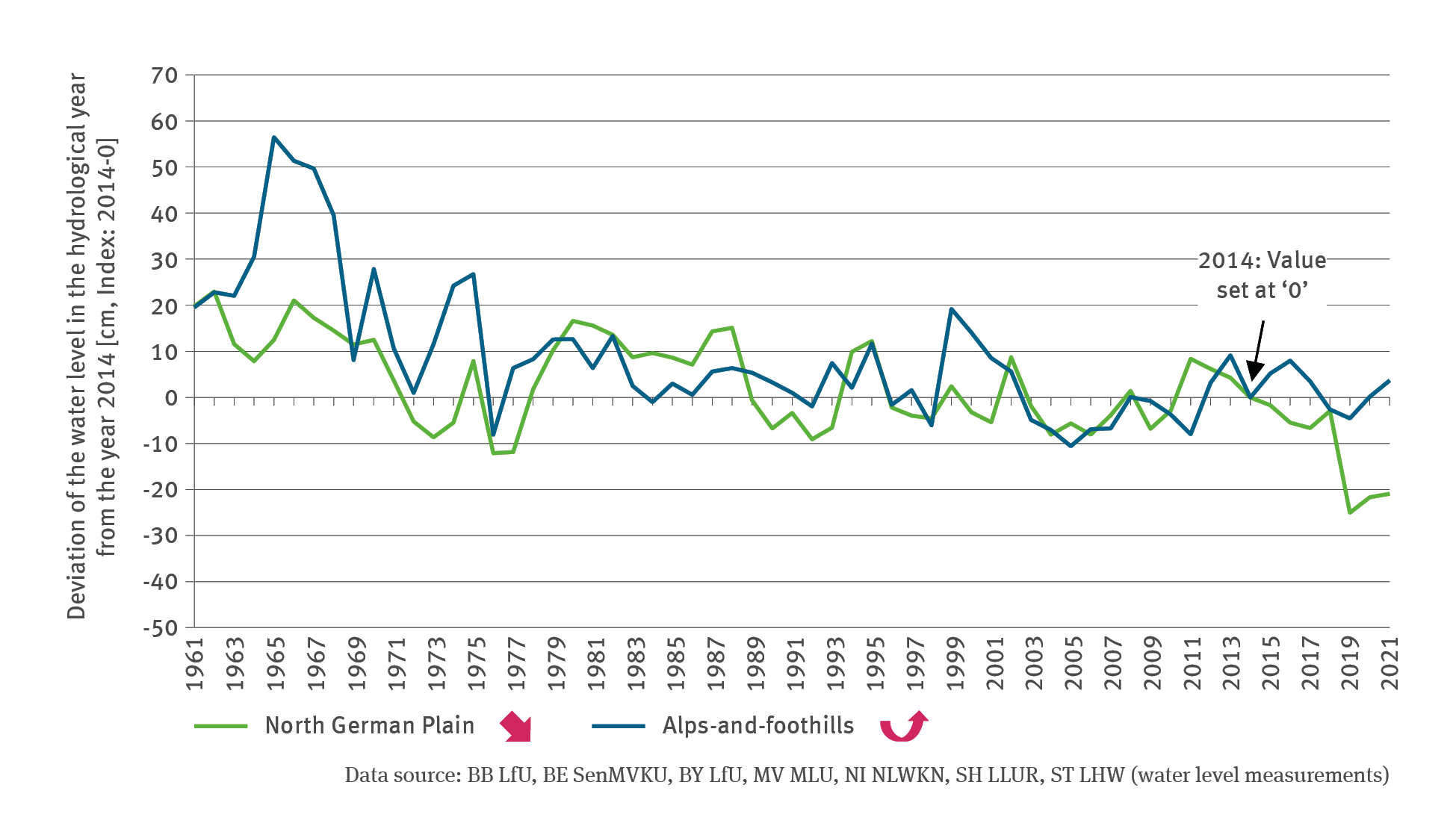
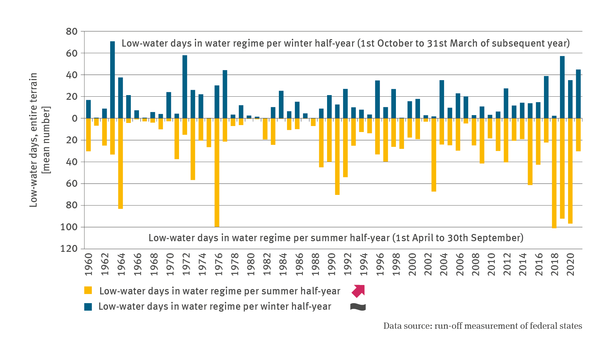
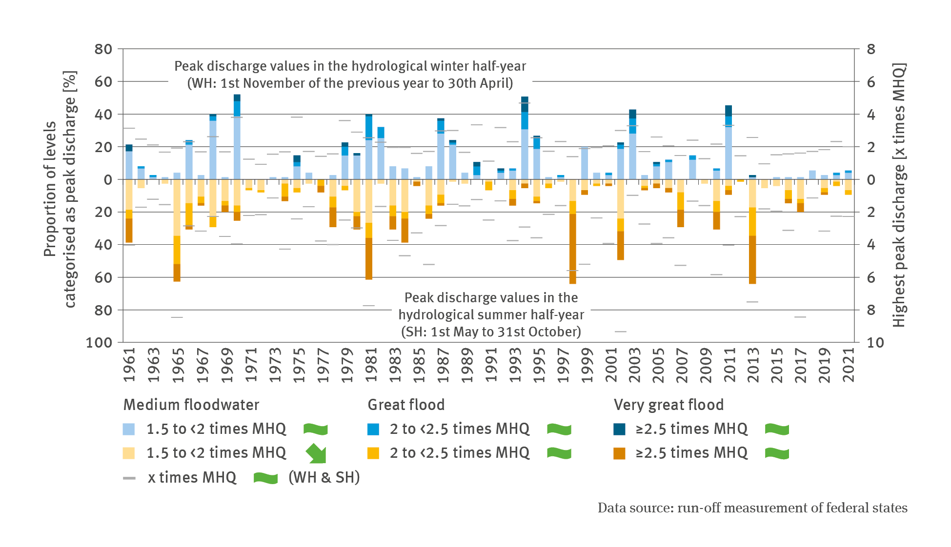
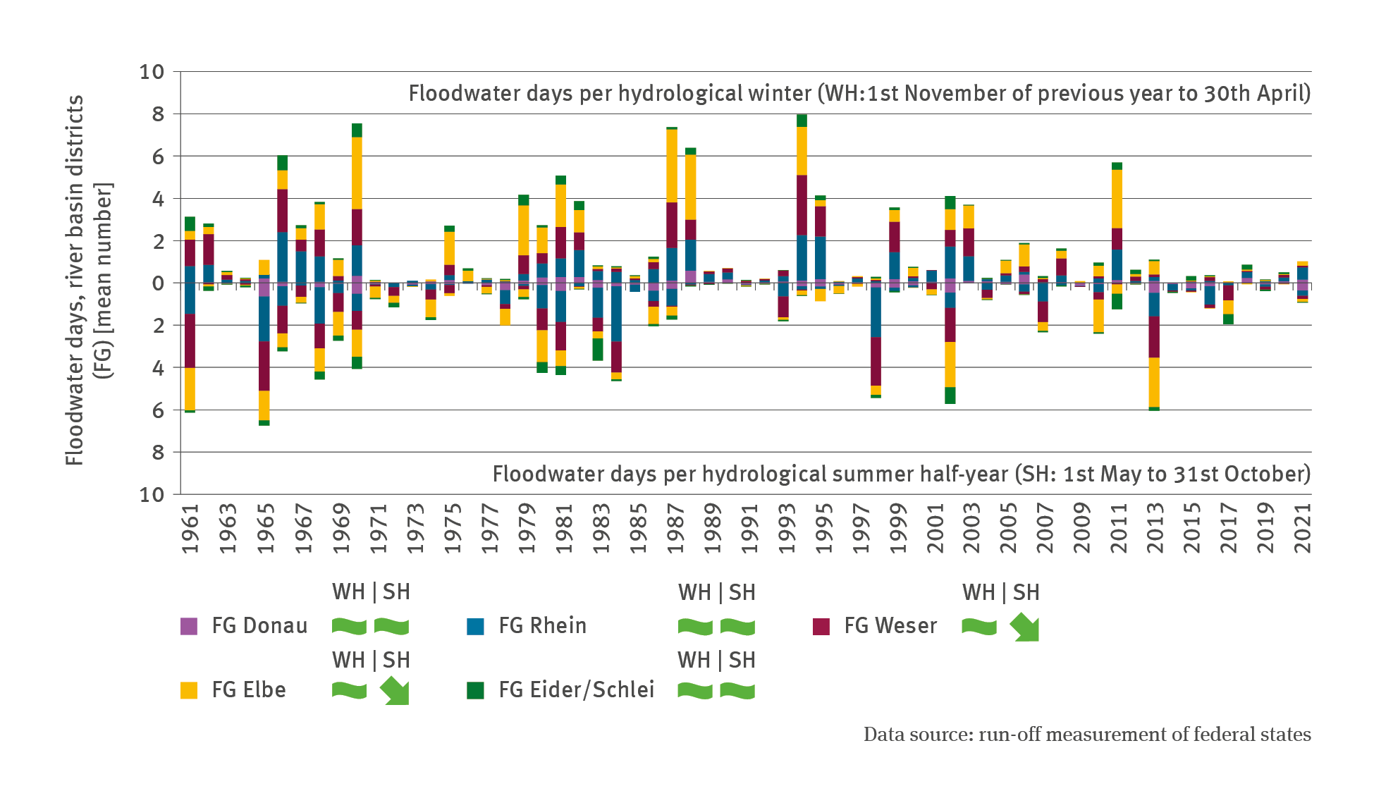
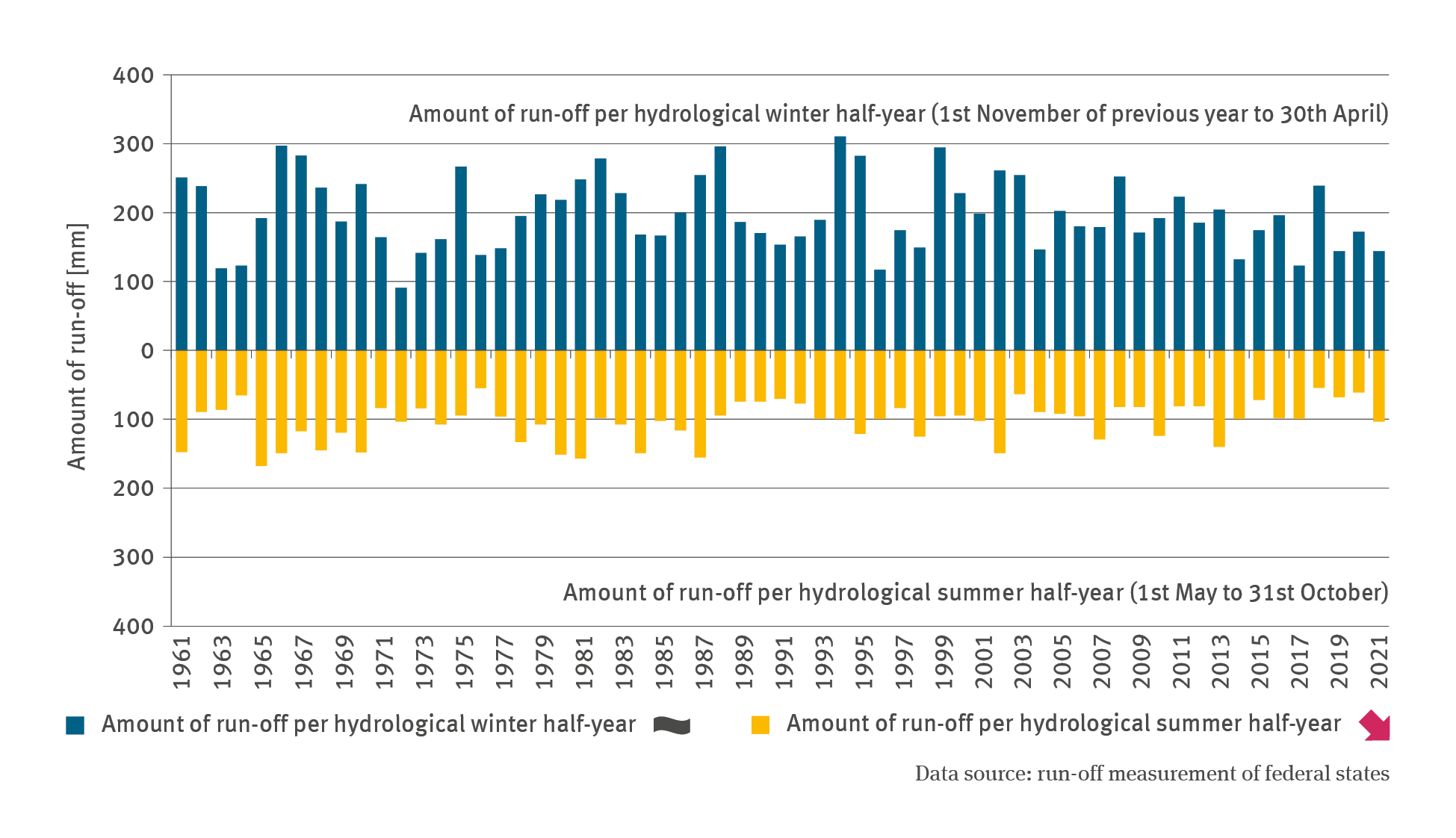
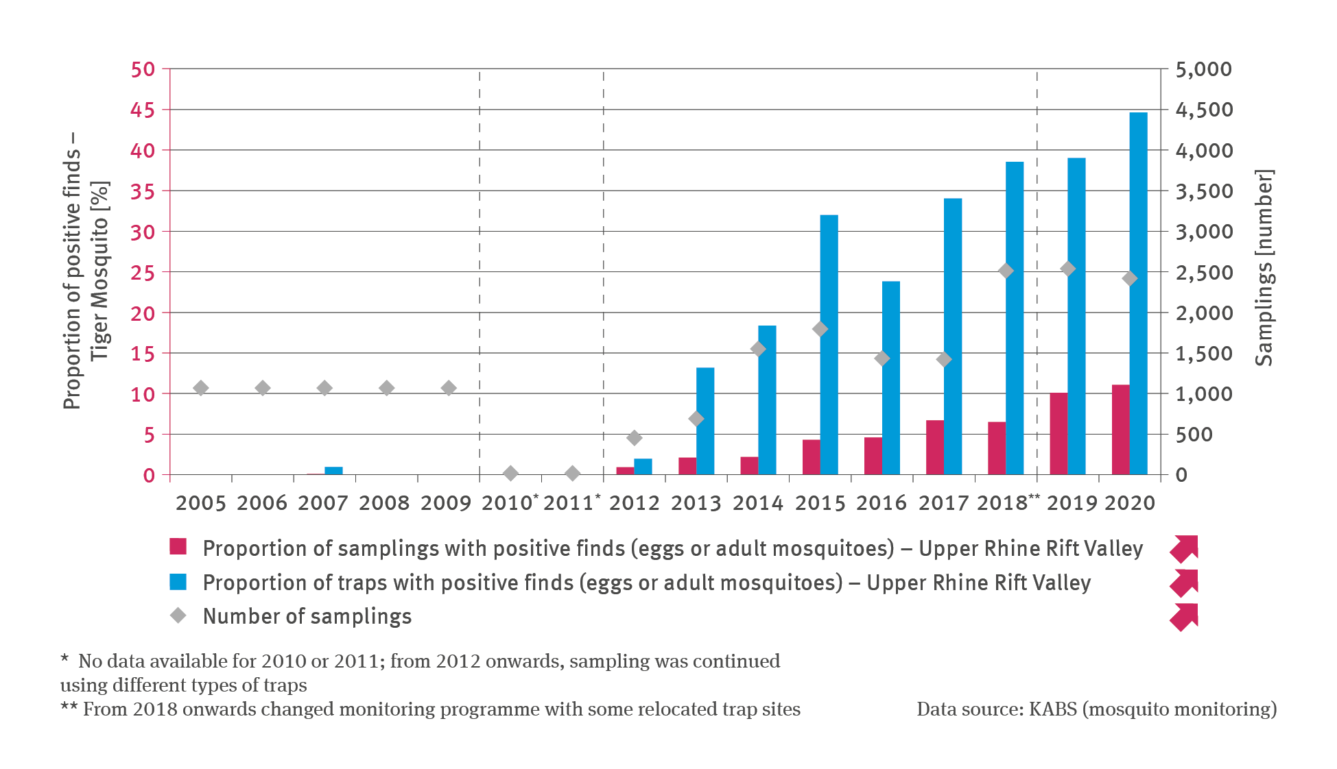
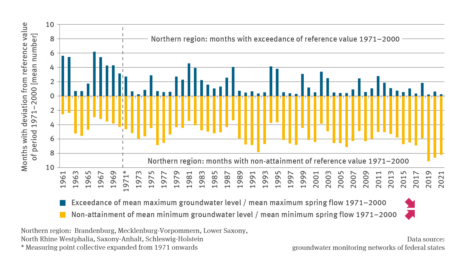
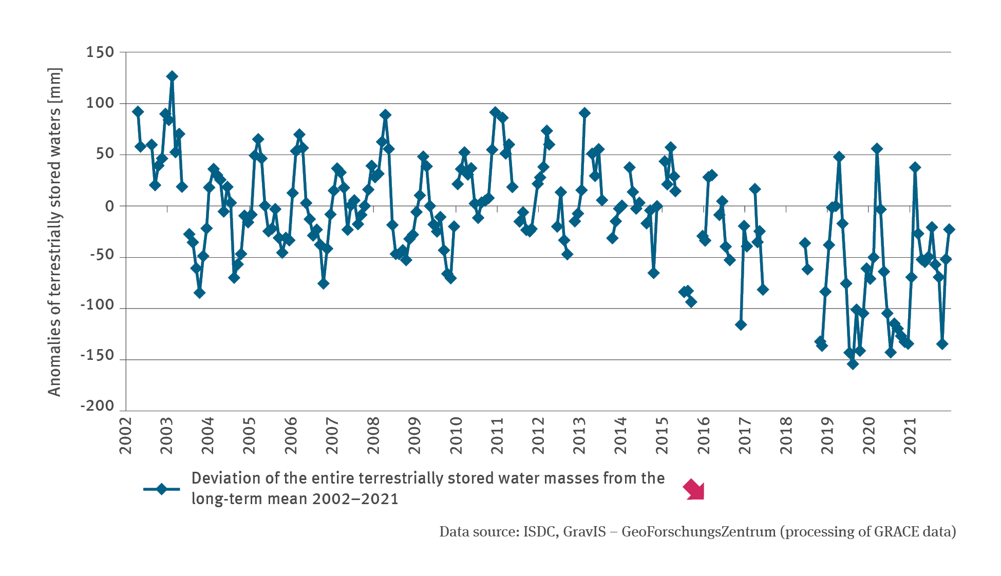
Data Search

Data Search

Here you will find diagrams, infographics, maps and tables for direct download.

Data Search

The bar chart WW-I-5 ‘Peak discharge values in watercourses’ contains a biaxial diagram. The bar chart shows for the years 1961 to 2021 – separately for the hydrological winter half-year (1st November of the previous year to 30th April) and the hydrological summer half-year (1st May to 31st October) – on one hand the highest peak discharge at selected watercourse gauges as a multiple of MHQ.

WW-I-5: Peak discharge values in watercourses

  • Klima
  • Wasser
  • Diagramme
Export data
PNG
The bar chart WW-I-4 ’Floodwater’ shows – for the years of 1961 to 2021 – the number of floodwater days in the hydrological winter half-year (1st November of the previous year to 30th April) and in the hydrological summer half-year (1st May to 31st October) respectively, prevailing in the river basins of the Danube, Elbe, Rhine, Eider and Weser. The structure of the indicator is characterised by individual flood events which typically influence several river basins.

WW-I-4: Floodwater

  • Klima
  • Wasser
  • Diagramme
Export data
PNG
The bar chart WW-I-3 ’Mean discharge’ shows the mean runoff depth for all river basins in Germany in the hydrological winter half-year (1st November of the previous year till 30th April) and in the hydrological summer half-year (1st May till 31st October) in the years of 1961 to 2021 in millimetres. The runoff depth in the hydrological summer half-year of 2021 decreased significantly during the period of observation, in the amount of slightly more than 100 millimetres.

WW-I-3: Mean discharge

  • Klima
  • Wasser
  • Diagramme
Export data
PNG
The illustration GE-I-5 ’Pathogen vectors – case study’ contains a biaxial chart. A bar chart is used to indicate – for the years from 2005 to 2021 – the proportion of samplings and traps with positive finds of the Tiger Mosquito (eggs or adult mosquitoes) in the Upper Rhine Rift Valley in per cent. The annual number of samplings is shown by means of dots. The chart contains three methodological breaks marked by dotted lines.

GE-I-5: Pathogen vectors – case study

  • Klima
  • Umwelt und Gesundheit
  • Diagramme
Export data
PNG
The bar chart WW-I-2a ’Groundwater level and spring flow – Northern Region’ indicates – for the years of 1961 to 2021 – the annual number of months in which the highest mean groundwater level was exceeded in the period 1971-2000 and the highest mean spring flow, as well as the number of months in which the lowest mean groundwater level and/or the lowest mean spring flow in the period 1971–2000 were not attained.
Export data
PNG
The illustration GE-I-4 ’Ragweed pollen burden’ contains a biaxial chart. For the years from 2006 to 2021 the lines show the annual mean total of ragweed pollen in pollen per cubic metre air. A differentiation is made between the central, northern, eastern, southern and western regions. In addition, the mean pollen total across all regions is illustrated. A particularly high ragweed pollen burden occurred in 2014 in the northern, eastern and central regions.

GE-I-4: Ragweed pollen burden

  • Klima
  • Umwelt und Gesundheit
  • Diagramme
Export data
PNG
The line chart WW-I-1 ’Terrestrially stored water’ shows the deviations of the entire terrestrially stored water masses from the long-term mean for the months of the period 2002–2021 in millimetres. The time series is marked by distinct fluctuations. While there is still a tendency towards positive anomalies at the beginning of the 2000s, it is clear that in Germany, the terrestrially stored water masses have been decreasing substantially since the beginning of 2010.

WW-I-1: Terrestrially stored water

  • Klima
  • Wasser
  • Diagramme
Export data
PNG
GE-I-3 ’Birch pollen burdens’ contains a biaxial chart. For the years from 1995 to 2021, the lines show the annual mean total of birch pollen in thousand pollen per cubic metre air. A differentiation is made between the central, northern, eastern, southern and western regions. In addition, the mean pollen total across all regions is illustrated. The curves fluctuate between 2 and 20 thousand pollen per cubic metre air.

GE-I-3: Birch pollen burdens

  • Klima
  • Umwelt und Gesundheit
  • Diagramme
Export data
PNG
The bar chart GE-I-2 ’Heat-related mortalities’ shows the estimated number of heat-related mortalities for the period from 1992 to 2021. A particularly high number of heat-related mortalities occurred in 1994 with the highest maximum value so far amounting to some 10,000 mortalities. In the years of 2003, 2006 and latterly 2018 the heat also led to an extraordinarily high number of mortalities. There is no significant trend discernible.

GE-I-2: Heat-related mortalities

  • Klima
  • Umwelt und Gesundheit
  • Diagramme
Export data
PNG
The illustration GE-I-1 ’Heat stress’ contains two lines indicating the number of hot days and the number of tropical nights respectively, in terms of the German area mean for the years from 1951 to 2021. Besides, the bar chart shows, for the years from 2005 to 2021, the mean number of days on which warnings were issued regarding major as well as extreme heat stress in the GWS warning districts. There is no significant trend discernible for the development of the number of days with heat warnings.

GE-I-1: Heat stress

  • Klima
  • Umwelt und Gesundheit
  • Diagramme
Export data
PNG

You can also search in other data portals of the German Environment Agency

Short link: www.umweltbundesamt.de/n300701en