Skip to main content Skip to main menu Skip to footer

Data Search

Data Search

Here you will find diagrams, infographics, maps and tables for direct download.

Data Search

The illustration BS-R-1 ’Information on how to act in a disaster situation’ contains stacked columns showing the percentual proportion of respondents who keep themselves informed on how to behave in a disaster situation. There are data for the years 2012, 2014, 2016 and 2021.

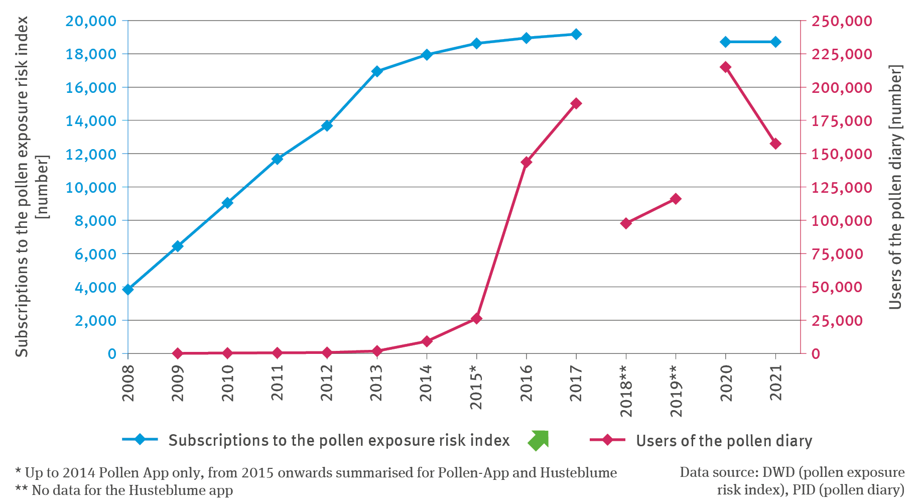
BS-R-1: Information on how to act in a disaster situation

  • Klima
  • Umwelt und Gesundheit
  • Diagramme
Export data
PNG
The illustration TOU-I-3 ’Market shares held by wider tourism areas’ contains a line chart indicating the market shares held by wider tourism areas in Germany. A differentiation is made between Alps with alpine foothills, coasts, uplands, urban-type areas as well as other areas. The values for the start year 2006 are fixed at 100 and for subsequent years until 2021 the values are indexed. Until 2009, the values for the different wider tourism areas were relatively close together.

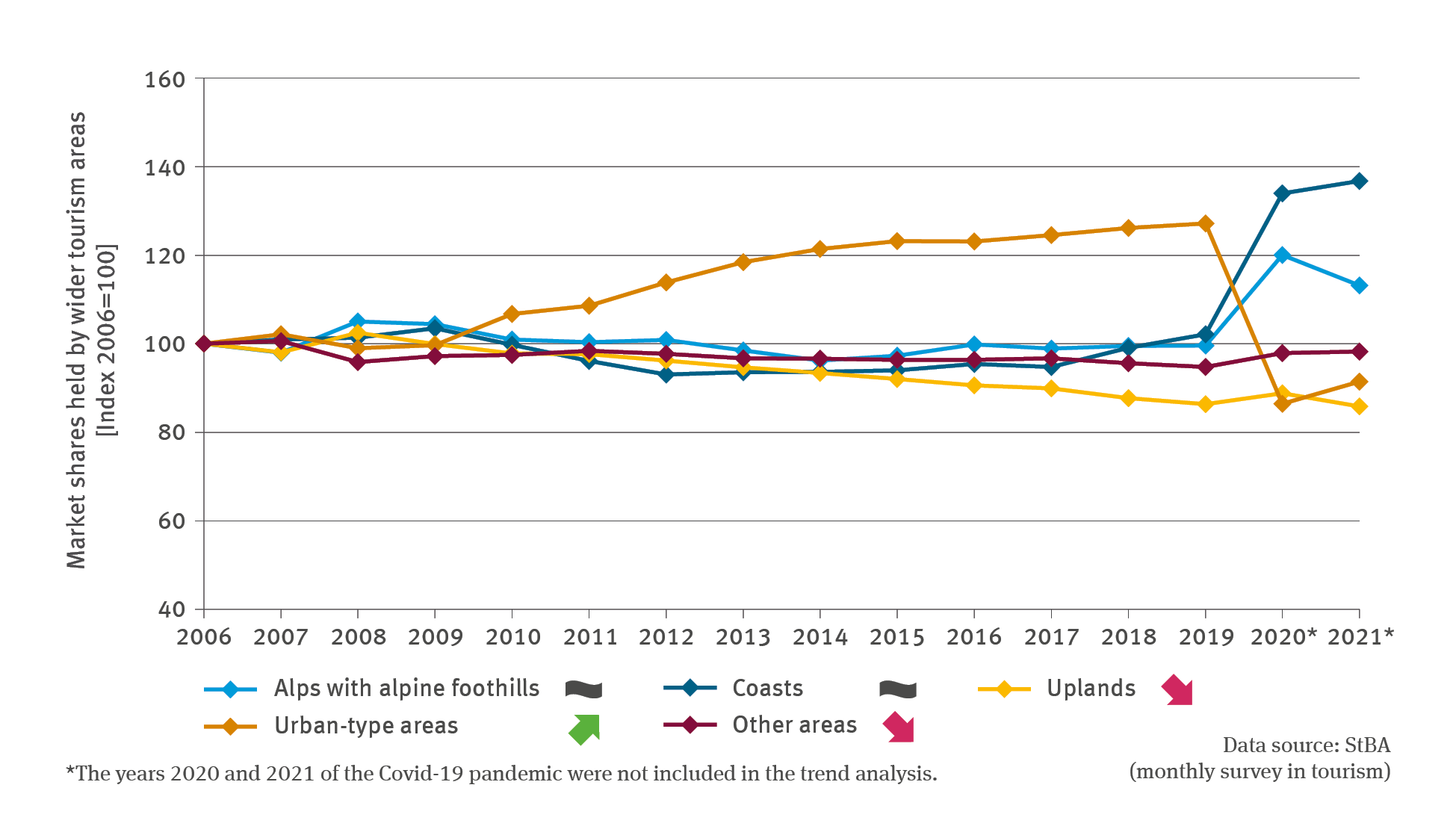
TOU-I-3: Market shares held by wider tourism areas

  • Klima
  • Umwelt und Gesundheit
  • Diagramme
Export data
PNG
The line chart illustrated in BAU-I-3 ‘Cooling degree days’ shows the mean of cooling degree days for 1951 to 2017 in summer climate regions according to DIN-4108-2:2013-2 in Kelvin per day. The illustration differentiates between the summer climate regions A, B and C. All three lines show a significantly rising trend over the years with distinct high points in 2003 and 2018, albeit with distinct fluctuations from year to year.

BAU-I-3: Cooling degree days

  • Klima
  • Umwelt und Gesundheit
  • Diagramme
Export data
PNG
The illustration BAU-I-1 ’Heat stress in urban areas – case study’ (Wärmebelastung in Städten – Fallstudie) shows three lines representing the number of hot days in the cities of Berlin, Frankfurt am Main and Munich during the period of 1986 until 2021. Apart from Munich, there are a few data gaps in these time series. In addition, a dotted line shows the areal mean for Germany as a whole. All lines show an increase, with fluctuations from year to year.

BAU-I-1: Heat stress in urban areas – case study

  • Klima
  • Umwelt und Gesundheit
  • Diagramme
Export data
PNG
The illustration GE-R-3 ’Information on pollen’ contains a biaxial chart. The chart shows the number of subscribers to the pollen exposure risk index and the number of pollen diary users. The number of subscriptions to the pollen exposure risk index increased to roughly 19,000 from the year of 2008 to the middle of the 2010s. Up to 2014 only the Pollen app was included, from 2015 onwards the figures are summarised for subscriptions to the Pollen app and the ‘Husteblume’ app.

GE-R-3: Information on pollen

  • Klima
  • Umwelt und Gesundheit
  • Diagramme
Export data
PNG
The bar chart GE-R-2 ’Public awareness of health problems caused by heatwaves’ illustrates the findings of a survey in which respondents were asked to state whether they expect that in future their physical wellbeing in their own living environment will be affected very severely, severely, little or not at all affected (by heatwaves). The survey was conducted in the years of 2012, 2014, 2016 and 2021. From 2012 to 2016 one of the options was ’don’t know’.

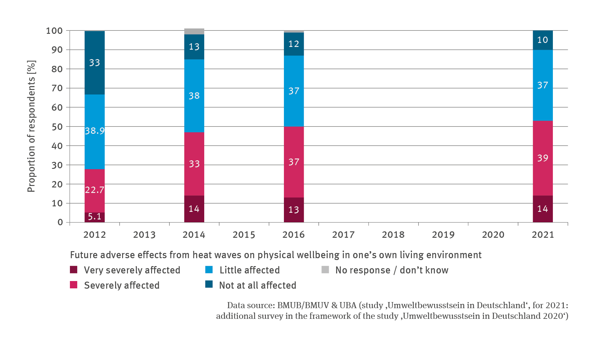
GE-R-2: Public awareness of health problems caused by heatwaves

  • Klima
  • Umwelt und Gesundheit
  • Diagramme
Export data
PNG
The bar chart GE-R-1 ’Heat warning service’ illustrates the annual number of newsletter subscriptions for the heat warning service provided by the GWS from 2008 onwards. The number was rising significantly and latterly amounted to just under 15,000 subscriptions. There are no data available for the years of 2018 or 2019.

GE-R-1: Heat warning service

  • Klima
  • Umwelt und Gesundheit
  • Diagramme
Export data
PNG
The illustration GE-I-5 ’Pathogen vectors – case study’ contains a biaxial chart. A bar chart is used to indicate – for the years from 2005 to 2021 – the proportion of samplings and traps with positive finds of the Tiger Mosquito (eggs or adult mosquitoes) in the Upper Rhine Rift Valley in per cent. The annual number of samplings is shown by means of dots. The chart contains three methodological breaks marked by dotted lines.

GE-I-5: Pathogen vectors – case study

  • Klima
  • Umwelt und Gesundheit
  • Diagramme
Export data
PNG
The illustration GE-I-4 ’Ragweed pollen burden’ contains a biaxial chart. For the years from 2006 to 2021 the lines show the annual mean total of ragweed pollen in pollen per cubic metre air. A differentiation is made between the central, northern, eastern, southern and western regions. In addition, the mean pollen total across all regions is illustrated. A particularly high ragweed pollen burden occurred in 2014 in the northern, eastern and central regions.

GE-I-4: Ragweed pollen burden

  • Klima
  • Umwelt und Gesundheit
  • Diagramme
Export data
PNG
GE-I-3 ’Birch pollen burdens’ contains a biaxial chart. For the years from 1995 to 2021, the lines show the annual mean total of birch pollen in thousand pollen per cubic metre air. A differentiation is made between the central, northern, eastern, southern and western regions. In addition, the mean pollen total across all regions is illustrated. The curves fluctuate between 2 and 20 thousand pollen per cubic metre air.

GE-I-3: Birch pollen burdens

  • Klima
  • Umwelt und Gesundheit
  • Diagramme
Export data
PNG

You can also search in other data portals of the German Environment Agency

Short link: www.umweltbundesamt.de/n300701en